

What is real money gaming?
Real money gaming is a form of online gaming where users can play using money at stake in the hopes of winning more. This includes various types of games such as rummy, poker, fantasy games, and other skill-based games.
What is Gameskraft?
Gameskraft is an Indian gaming company that focuses on developing and providing online gaming platforms.
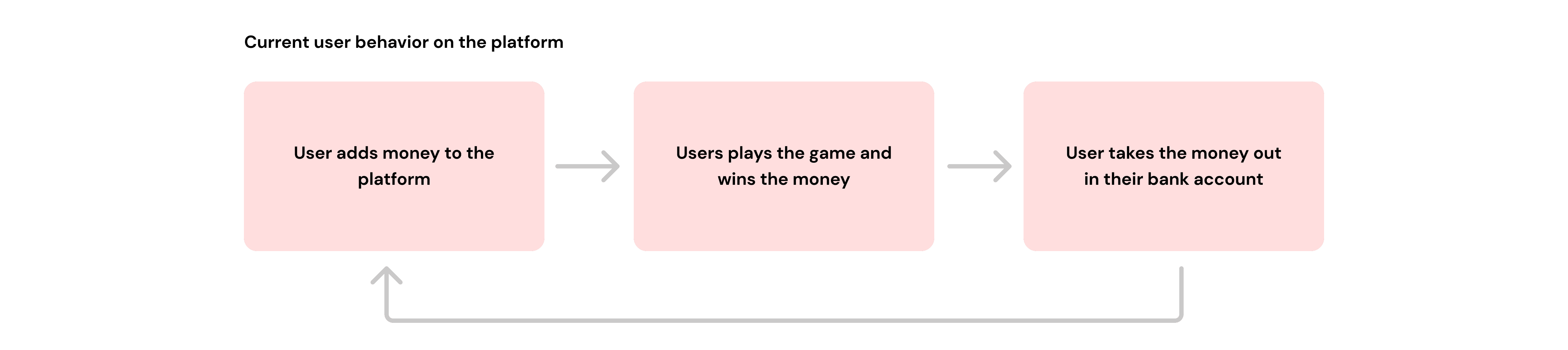
RummyCulture is India’s biggest rummy platform where 2 or 6 players can put some money into the game of rummy and 1 player wins the entire pot minus our platform fee(15% of the total pot).
E.g. If two players are playing with ₹100 then one of them will lose and the other player will win ₹170 and Gameskraft will earn ₹30 in platform fee.
Our User Persona


The project is divided into two parts:
Part 1 — Pre GST revamp
Part 2 — Post GST changes
Overview
This case study illustrates our comprehensive initiative aimed at enhancing the user experience when adding cash to the RummyCulture app. Our goal was to adapt to our new RummyCulture brand identity, focusing on visual appeal with intuitive navigation resulting in a more simplified Add Cash flow.
My role
I led the project as a sole designer for duration of 1 month in Part 1 and 2 weeks in Part 2. I was responsible for creating the user experience, user flow, user interface, prototypes, competitor analysis, usability testing and cognitive walkthrough.
I also collaborated with the product and tech team for creating designs which are aligning with user and business goals while also helping in smoother implementation.
What is 'Add Cash'?
The term ‘Add Cash’ within the RummyCulture context pertains to the action of depositing money from your bank accounts into the app in order to play games of a particular ‘Buy-In’ with that money.
I. Research
Primary research is like a treasure hunt in the world of customer experience! It helped us get insights to shape better experiences.
We talked to over 10 of our esteemed players, listened to their tales of triumph and woe, and boy, did we hit the jackpot of insights!
Additionally, we analysed more than 200 customer support calls received, identifying and documenting the primary challenges faced by users.
Later we segregated the problems and went ahead with analyzing the existing flow.
Secondary Research - Thorough analysis was conducted to understand the offerings of our competitors.
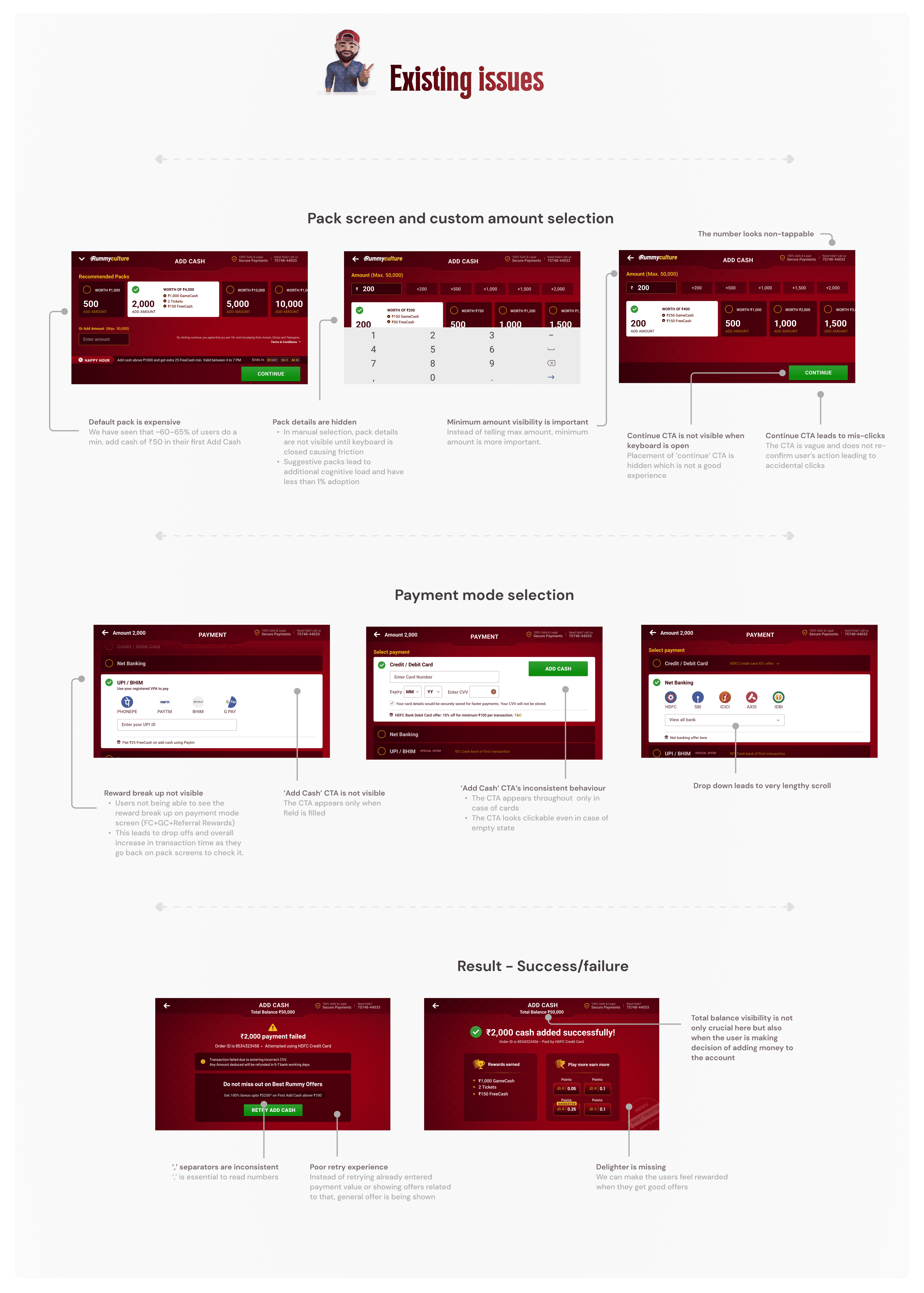
Experience related
Use of dark patterns: Implementing a dark pattern to auto-select the highest amount makes the selection process less transparent, especially with a vague association to the 'continue' call-to-action.
Lack of minimum and maximum value indicators alongside a cluttered interface with excessive colours, font sizes, and non-tappable areas diminishes user experience.
Unclear value propositions upon adding amounts, terms like "+100" and "+250" are confusing.
Users should be informed of the selected amount before reaching the payment mode selection.
Interface related
Improving readability by including ',' in numbers, optimizing space utilization, and enlarging tap areas for calls-to-action can enhance usability.
Implementation related
The placement of elements appears disjointed, contributing to a less intuitive user interface, exacerbated by a glitchy transition from landscape to portrait orientation.
II. Problem statement

III. Ideation
Now, onto the fun part - design ideation! I rolled up my sleeves, grabbed my lucky rabbits' feet, and dived headfirst into a sea of sketches, wireframes, and prototypes. I experimented with more variations than a magician with a deck of cards - and let's just say, the results were magic! 🪄
➡️ Idea 1: Enhancing offer visibility and highlighting rewards on pack screen to increase forward movement for non-converted players.
➡️ Idea 2 : Improving the custom amount selection experience one to drive forward movement for non-converted players.
➡️ Idea 3: Experimenting with defaulting to ₹50 for new users and adjusting pack recommendation logic to boost forward movement.
➡️ Idea 4: Changing the pack recommendation logic by surfacing amounts which most players do in their first add cash to drive higher forward movement for non-converted players
One more realisation came in the process was that new users might not know what is GameCash and FreeCash.

So, we wanted to familiarize users with the platform currencies in the beginning itself. Therefore, we introduced these terms associated with the rewards. 🤑
Feedbacks and retrospections
I started exploring with the pack screen as its the key page then stacked the deck in favour of simplicity, clarity, and user delight.

Improvement points
😵 Is there a way we can reduce the clutter and help the user focus on the 'most relevant' fields?
🤯 Can we avoid having multiple numbers to prevent users from getting overwhelmed, potentially distracting from the main action?
🤔 Do we need so many cards? According to Hick's law more choices mean more delays - keep it concise for satisfied users!
😍 Rewards info can be omnipresent. This will help the users to complete the flow faster
👀 Do we need all those vibrant game variant tiles taking up the focus on the success screen?
Aligned points
✅ The CTA can have the selected pack amount to make the informed decision
✅ Offers should be on top as we had seen increased transactions by 3% during an experiment
✅ Instead of having full page for transaction failed, we can have bottom sheet for it. Smoother redirection when choosing a different mode
I also tried thinking from a new angle where quick pills can be used to enter amount instead of packs where we give custom amount high priority. This approach later translated into a further defined version.
IV. Final Designs (Pre GST)
And now, after countless rounds of testing, tweaking, and refining, I present to you… the final designs!


Metrics
😍 Add cash drop offs improved by 20%
🥰 Net-banking success rates remain stable despite the introduction of the portrait version, while wallet success rates have increased by 3%
🤗 Overall success rate jumped by 6%
Earlier last year, the GST Council announced its decision to impose a 28% GST on the full amount being paid at the entry level for online gaming. It came into effect on October 1, 2023 in line with the notification issued by the finance ministry.
What was going to happen on 1st Oct 2023?
Earlier, Govt. used to tax the “profit” made by the RMG companies. E.g. If Gameskraft is making ₹30 then it will pay 28% tax on its profit.
Now, Govt. has decided to tax the players. E.g. If a player is putting ₹100 then they will only get ₹78 to play with(28% tax). So now, if two players are playing then the winner will only win ₹132(₹78*2–15% commission). After this law, the value proposition might not seem good enough. Hence, it will be a huge deterrence for the player to come and risk their money.

I. Product Solution
To keep the value prop intact, we decided to give back the amount paid by users in taxes in the form of rewards.
II. Design solution
Now with the new flow, our old game currencies 'GameCash' and 'FreeCash' became irrelevant so we introduced 'Discount Credits'. These can be used to play any game at discounted Buy-In of 10%.

With the change in value proposition, the idea was to communicate to the users how much playable amount they will get. We needed to show that because there was already a lot of buzz around the new tax laws and players were afraid that they will not be getting the full amount. E.g. So, we wanted to communicate, if a user is adding ₹1,000 then they will be getting ₹1,000 or more (with the help of rewards aka Discount Credits)
To create user awareness for the new GST change, we gave temporary area to the video banner as well.
The similar changes were done in the payment mode and success/retry screen to maintain consistency.
👁️ Insight: While we were redesigning the flow. Our creative team was revamping the mascots to make them resonate more with our current players.
III. Final Designs (Post GST)
The designs went live on 30th September with the changes.

IV. Numbers and Problems
As the redesign consisted of compliance change, we had to roll out the feature to 100% of our users on 30th September, 2023.
Our major focus areas was to make the navigation easier for the users so that forward movement and transactional success rate increases. As of October 2023, these are the numbers:
With the new flow, we quickly started observing jump in rate of successful transactions by 11%. 🤩
We wanted to eliminate friction caused by poor visibility of CTAs and unwanted cognitive load. Our new custom amount’s adoption increased from 39% to 78%. 📈🎉
Area of concern
Since, we removed the auto-selected packs, the clicks for amount selection by players dropped in new flow to 66.1% from 89.4%. 📉
After engaging with players, we discovered a decline in the desire to play due to negative sentiment surrounding new tax laws, coupled with a perception of diminished rewards on the platform.
V. How did we solve it in design?
To tackle the problems identified in the previous version. I made some changes in the pack screen.
To make the experience better, I put the packs in the area of thumb region for easy selection while holding phone in landscape mode.

Here's a prototype video that you can see.
VI. Results
😍 Forward movement on pack screen improved by 34% reducing drop offs which was a major focus area and concern.
😁 Overall we saw a 3% improvement in successful Add Cash transaction for new registrations.
😄 We also saw increment in new user acquisitions.
😊 For existing players, there was no negative impact. Movement remained similar.
Conclusion & learnings
Embarking on this UX design journey has been a rollercoaster of creativity and insights. From wireframes to user testing, we’ve sculpted experiences that blend functionality with delight.
As I bid adieu to this project, let’s carry forward the lessons learned:
Understanding user evolution on the platform
Users are the king of any product. Understanding the target user group is crucial to create designs which truly address their concerns.
For example, one insight that we got is our new users go ahead with auto-selected packs. However, over the time, our repeat users choose custom amount selection which is whopping 90%. Hence, it became vital for us to improve this experience for our valued players.Comparison helps getting value for money
In real life when we buy a commodity, for example, when someone buys rice, they tend to compare price and weight to see what fits their needs the best. Similarly, our users compare different packs and its offerings to make an informed decision hence, showing them upfront helps in faster decision making.Rewards drive gaming; embracing the feeling they bring is essential.
In the gaming industry, rewards are the heartbeat. They not only amplify the gaming experience but also entice players to hone their skills. So, whenever the user gets a reward, gratification factor drives better overall experience.
Thanks for reading! So, until next time, keep shuffling, keep dealing, and keep spreading the RummyCulture love!

© 2024. Shivangi Shrivastava
India