

Background
What is real money gaming?
Real money gaming is a form of online gaming where users can play using money at stake in the hopes of winning more. This includes various types of games such as rummy, poker, fantasy games, and other skill-based games.
What is Gameskraft?
Gameskraft is an Indian gaming company that focuses on developing and providing online gaming platforms.
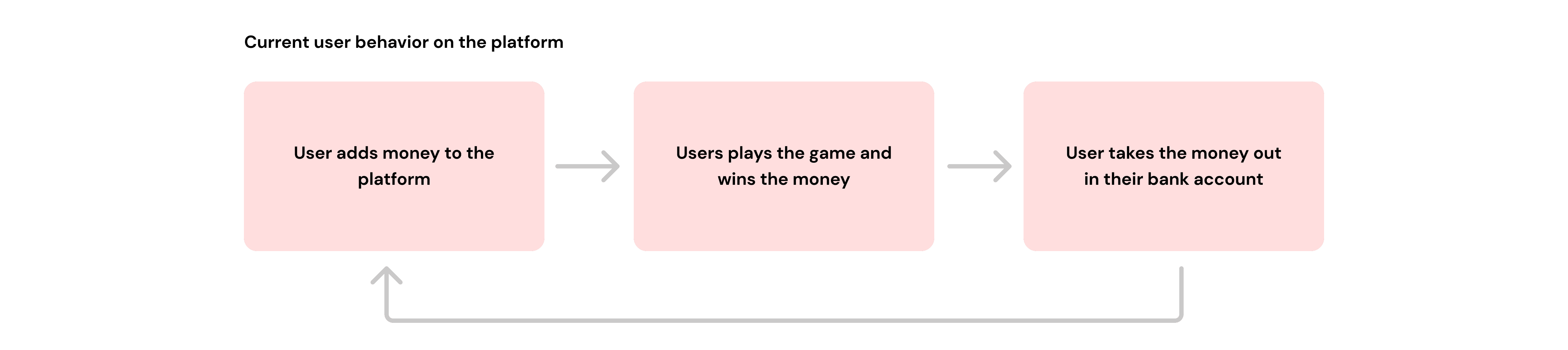
RummyCulture is India’s biggest rummy platform where 2 or 6 players can put some money into the game of rummy and 1 player wins the entire pot minus our platform fee(15% of the total pot).
E.g. If two players are playing with ₹100 then one of them will lose and the other player will win ₹170 and Gameskraft will earn ₹30 in platform fee.


My role
I led the project as a sole designer for duration of 1 month. I was responsible for creating the user experience, user flow, user interface, prototypes, competitor analysis, usability testing and cognitive walkthrough.
I also collaborated with the product and tech team for creating designs which are aligning with user and business goals while also helping in smoother implementation.
Why wallet? - We didn't have an existing wallet.
When you design wallet for a gaming app - You’re not just creating a place to stash virtual coins. It’s like crafting a magical satchel where players store their unlockables, fortunes, gaming transactions, etc. — a treasure trove that fuels their epic adventures in the digital realm! 🎮✨


I. Research
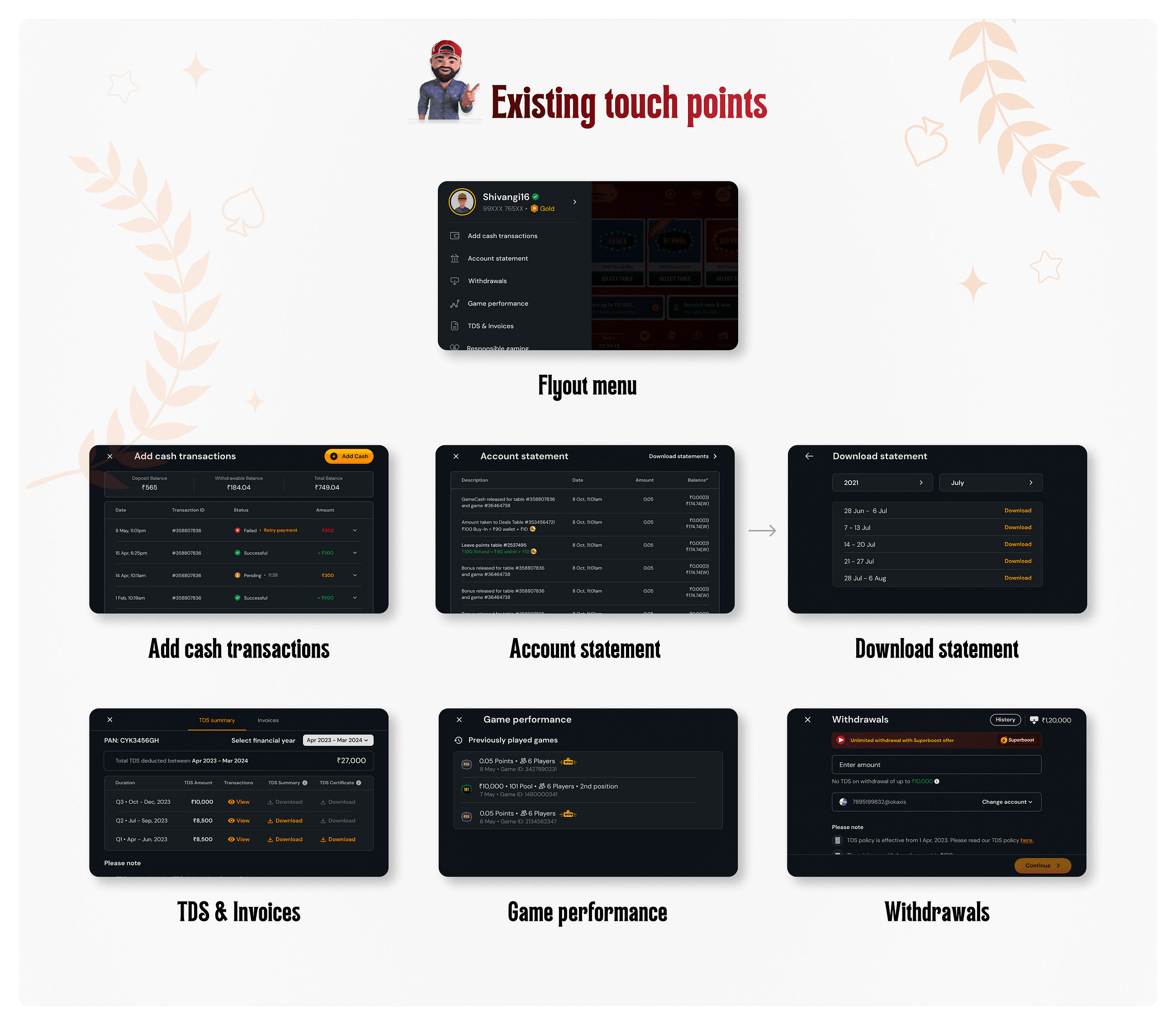
Primary research - We analysed user behaviour on the platform and the touch points they use for finding transactional information.

Secondary Research - Thorough competitor analysis was conducted to understand the offerings of our competitors, offerings by traditional wallet and banking apps.

Findings
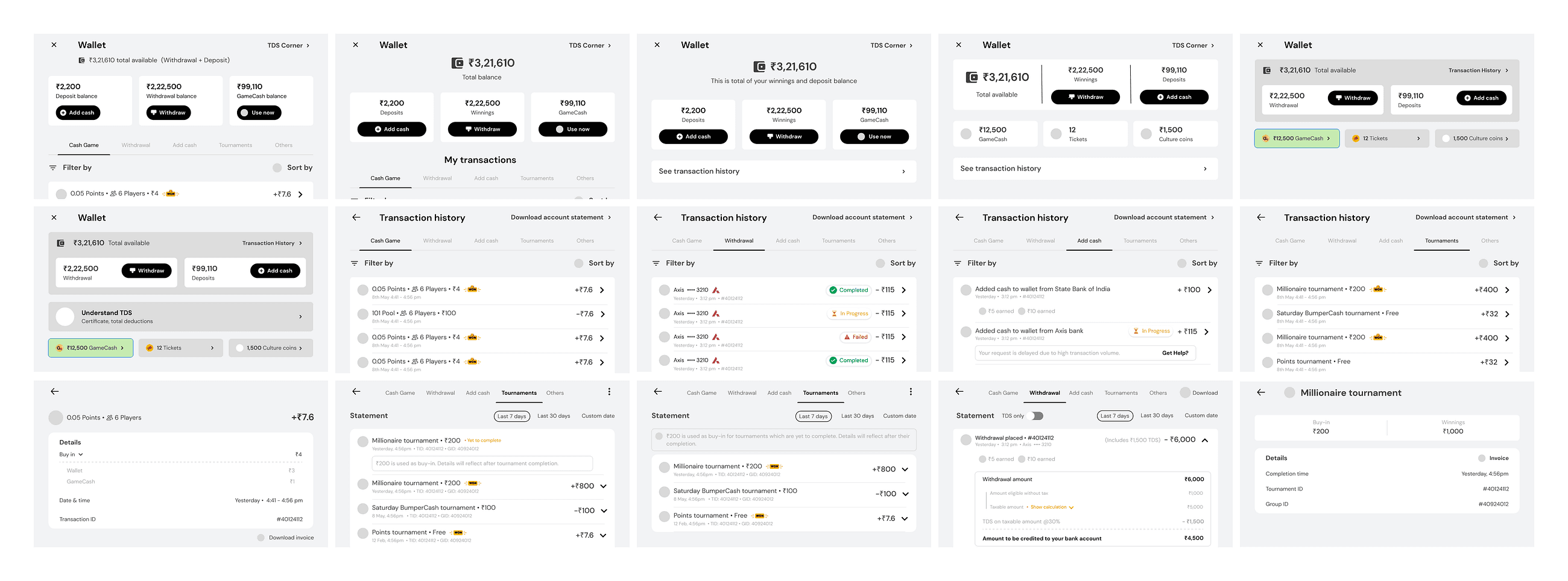
When the user comes for the first time, overview of main balances should be clearly visible.
Transactional information should be accessible according to the relevancy.
In RMG, TDS plays an important role and information regarding it should also be accessible easily.
Users may require access to statements for tax filing purposes or just keeping themselves updated of their actions on the platform.
Wallet should be simple and intuitive. A lot of applications fill it with ads and make the scroll very lengthy leading to difficulty in finding the required features.
II. Problem statement
III. Ideation and wireframes
To start the ideation, I narrowed down the features specifically tailored for RummyCulture users. The platform must seamlessly integrate the following components to provide users with relevant information:
Account Statements: Users should have access to detailed summaries of their account activities, including deposits, withdrawals, rewards earned, and any deductions.
Withdrawals: Users must be able to review their withdrawal history, including transaction dates, amounts, and any associated fees or charges.
TDS (Tax Deducted at Source): The platform should provide users with visibility into any tax deductions made on their transactions, ensuring transparency and compliance with tax regulations.
Add Cash Transactions: Users should be able to track all instances where they added cash to their accounts, including amounts, dates, and any promotional offers or bonuses associated with the transactions.
Game Performance: The platform must include insights into users’ gaming performance, such as win-loss cases, Culture coins, GameCash earned, game statistics, and any relevant metrics that help users gauge their gaming proficiency and progress.
The solution should prioritise user-friendly interfaces, intuitive navigation, to ensure a seamless and secure user experience. Additionally, the platform should be scalable to accommodate future enhancements and integrations while maintaining high performance and reliability.
I started with mid-fidelity wireframes to first align on the initial starting point. This helped us to detail out further.

After some initial ideation, we aligned on certain things and I started exploring the designs in our brand style.

Feedbacks and retrospections
🤔 Can we decide a place where we can have total balance placement consistent across the app starting from wallet?
🎬 What will be the primary actions on the wallet? Can we present them at single glance?
🔦 How much prominency should we give to the TDS information?
💰 Let's give different pages for rewards as per current feasibility.
😎 Can we share the game related information to the user in the details? It will help them understand about their win/loss numbers.
👤 What kind of a filter will be most relevant to the user?
⏱️ What is the ideal duration for which user will be seeking the information for?
☎️ Can we have the account statement for different durations? CX call volumes for monthly, quarterly, annual statements have been increasing.
💸 For showing consumption of a reward pack, progress bar is more efficient and understandable than a pie chart element.
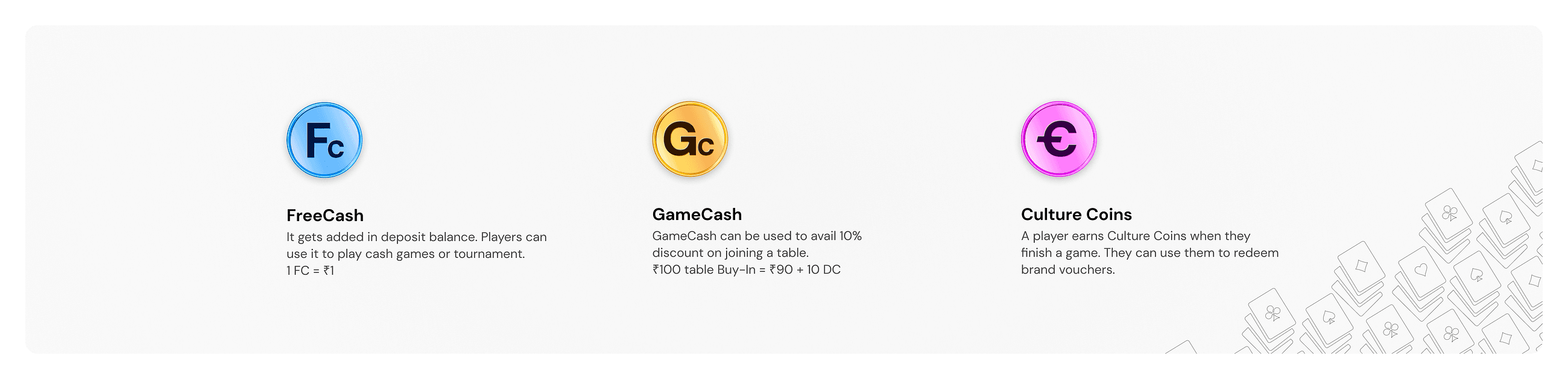
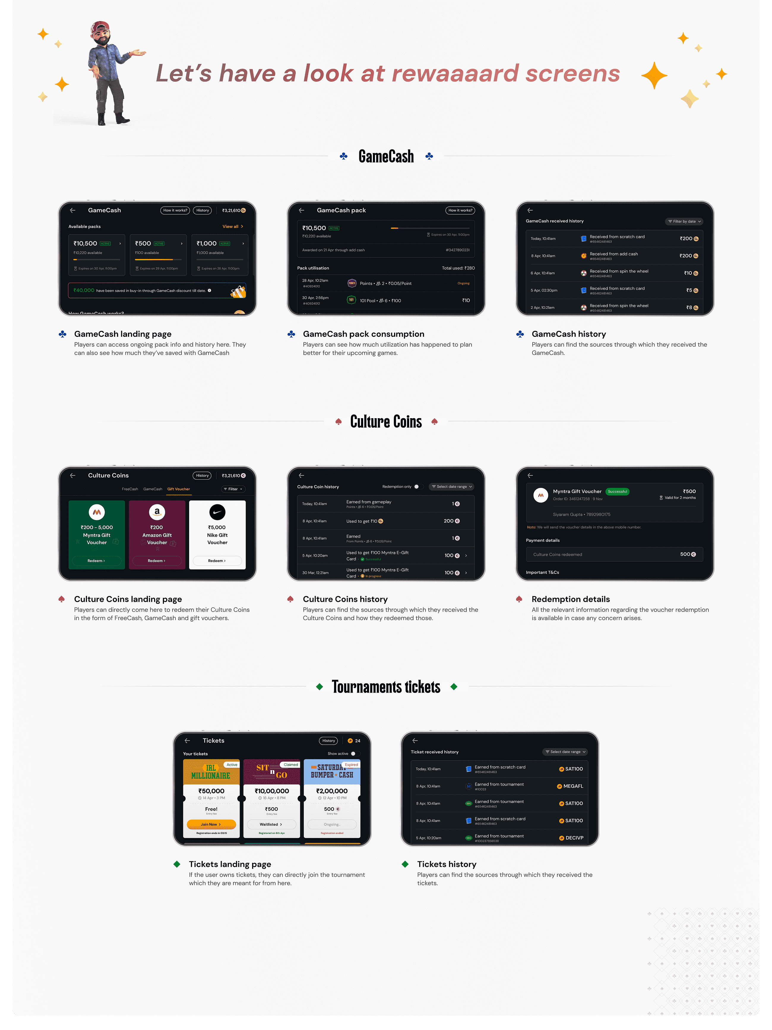
Before I delve into the final designs, let me familiarise you with our platform currencies 💸💰
IV. Final Designs
And now, after countless rounds of testing, tweaking, and refining, I present to you… the final designs!

And voila! 🎉 This went live for the users in last June. Upon analysis of data it was clear that the users were finding the navigation simpler and were able to access the information.
Here's a prototype video that you can see.
V. Results
😍 Wallet engagement is ~81.2% daily which was a key metric.
😁 Our call volumes came down to ~768 and during filing it came down to ~5,257
😊 On other pages, there was no negative impact. Movement remained similar.
Key takeaways
Contextualise: Setting context in design ideation is crucial as it frames the problem, defines constraints, and clarifies objectives. We had to define wallet keeping in mind our users and features relevant to them in context of gaming. We could've made graphs, shown progress over the time but it does not add value nor our user base is able to comprehend such complex visuals. In our case, we meticulously chose to build the features our users would be helped with in long term.
Optimal balance: Giving the right amount of information and not overloading the players is also crucial to have a good user experience. We carefully designed each feature with intuitive navigation and consistency to reduce cognitive load.
Persist: When we started with the project, I did in depth research about the users needs and concerns. This helped me had conviction about the ideas and designs I'm proposing. Throughout the iterative process, I passionately advocated for its value and consistently highlighted how it could solve the challenges our users were experiencing. Ultimately, the instincts proved to be right, and we implemented the wallet design.
© 2024. Shivangi Shrivastava
India